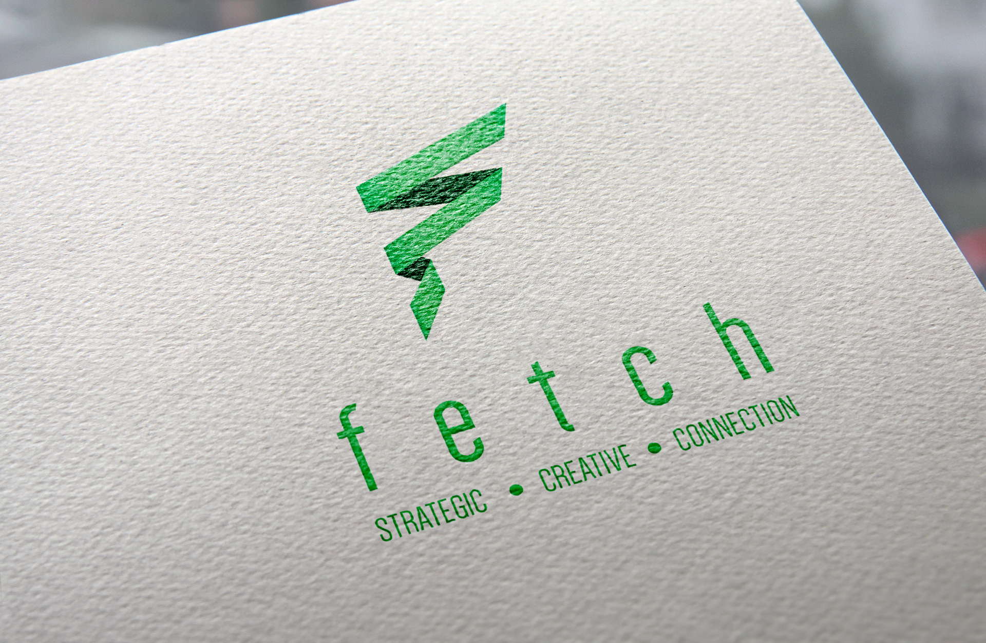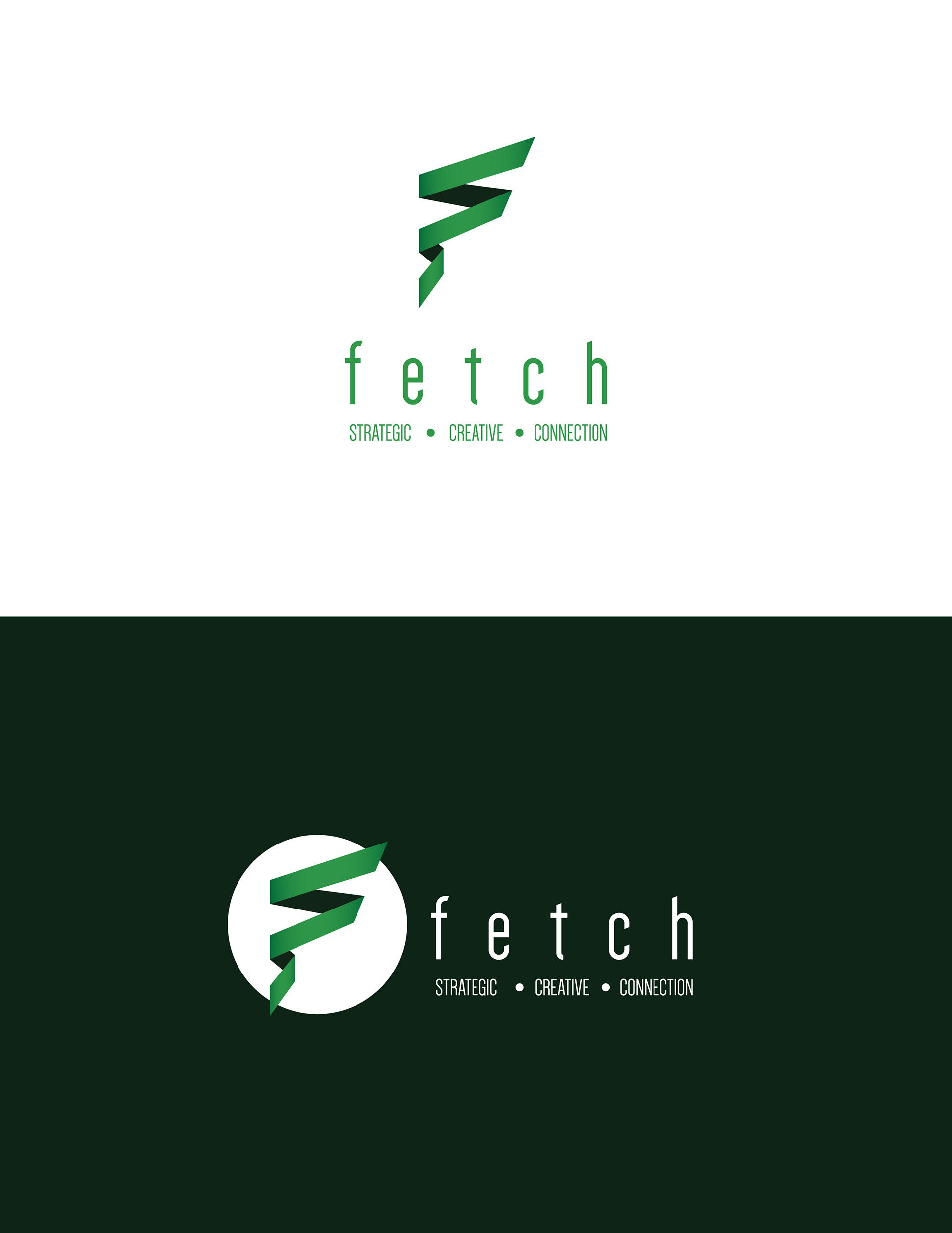
Logo / Brand Development
Modern and professional type treatment. Weighty enough to "hold it's own" on a page - Simple enough to be used on a business card. Alterations to Dense-Regular make it more unique and to reflects the angles of the logo.
The logo needed to be creative and fun, while keeping in mind keywords like "Connect", "Bring-together", Connecting-the-dots", and "Reaching Goals".
The ribbon-like graphic brings all of those things together. The pointed edges allude to Arrows that provide directionality and movement forward. When thinking of ribbon, one's first thoughts might be the tying of a bow around a group of items ("Bringing together/gathering"), or presenting the perfect gift to someone. This is exactly what Fetch does. Bringing the right people, the right strategy, the right tools, at the right time, and putting a bow around it before presenting it to clients.